
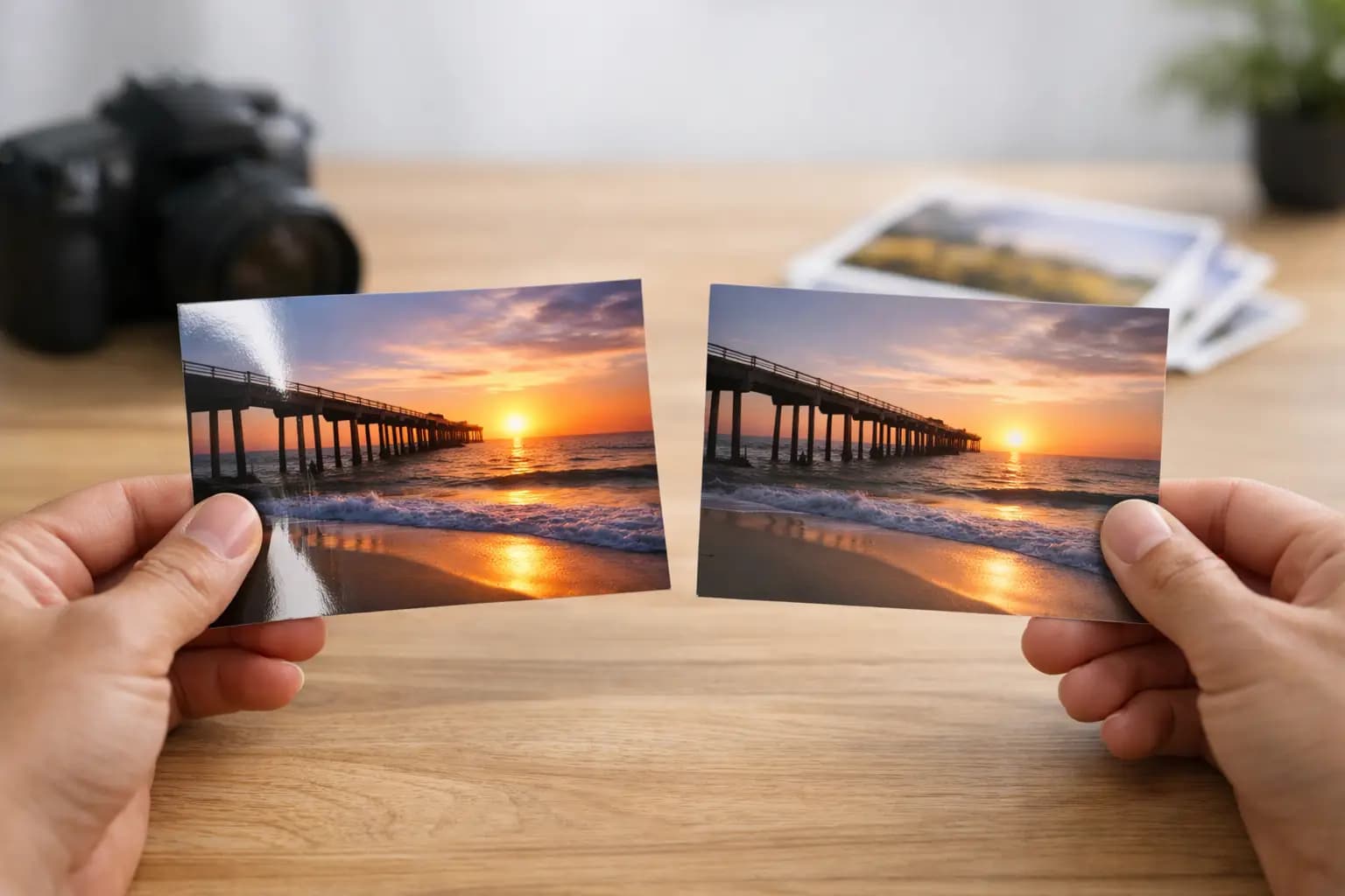
A photo can look quite different once it is printed, even when the image file is exactly the same. Choosing a gloss or matte photo finish affects how the print handles light, how colours appear and how well it stands up to everyday handling. There is no single right answer, but the intended use of the print usually makes the choice clear.
For a bright holiday photo going into an album, gloss may give the colour and detail you want. For a family portrait in a sunny room, matte can be the more practical option. A good finish should suit both the photograph and where it will be enjoyed.
Gloss or matte photo finish: the quick difference
Gloss prints have a smooth, shiny surface that reflects light. This finish tends to make colours look more vivid, blacks look deeper and fine details appear sharper. It is a popular choice for snapshots, colourful landscapes, party photos and images with plenty of contrast.
Matte prints have a softer, non-reflective surface. They reduce glare and are less likely to show fingerprints, which makes them useful for prints that will be passed around, placed in albums or displayed near windows and lamps. Colours can appear slightly more restrained than on gloss, but matte gives many portraits and black-and-white images a calm, professional look.
The choice is less about one finish being better than the other and more about what matters most for that particular print: maximum brightness, or easier viewing and handling.
When gloss is the better choice
Gloss works well when you want a photograph to have immediate impact. The reflective coating helps bright colours stand out, particularly blues, greens, reds and golden sunlight. A seaside holiday, a child’s birthday party or a vivid garden photo can all benefit from that extra lift.
It is also a strong option for smaller prints. On 6x4 or 7x5 prints, the sharper-looking surface can bring out detail in faces, clothing and backgrounds. If you are making an album of everyday memories and want photographs to look punchy as you turn the pages, gloss is often a dependable choice.
There are trade-offs. Because gloss reflects light, it can be harder to view under spotlights or opposite a window. It also shows fingerprints and smudges more readily. This is not usually an issue for a print that will sit in a frame, but it matters for loose prints handled by children, shared around a table or used in a scrapbook.
Gloss is particularly worth considering for:
- Colourful holiday, travel and outdoor photos
- High-contrast images with clear detail
- Small and standard-size prints for albums
- Prints that will be framed away from strong direct light
When matte is the better choice
Matte is the practical favourite when a print will be handled often. Its low-shine surface is more forgiving of fingerprints, and it does not produce the same distracting reflections as gloss. That makes it ideal for family albums, school photos, heritage images and prints you expect people to pick up and look at closely.
It is often a sensible finish for framed photographs too, especially in rooms with lots of daylight. A beautiful portrait can lose its effect if the viewer only sees a reflection of the window. Matte helps keep attention on the image itself.
Portraits can suit matte particularly well. Skin tones often look soft and natural, while the reduced sheen gives the print a more understated appearance. If you are printing a wedding photograph, a relaxed family picture or an older scanned image, matte may feel more appropriate than a highly reflective finish.
Black-and-white photography also benefits from matte in many cases. The finish supports gentle tonal changes and can give the print a classic look. That said, a dramatic black-and-white image with very dark shadows may still look excellent in gloss. The style of the photo matters as much as the subject.
Think about where the photo will live
Before placing an order, picture the print in use rather than only on your mobile phone screen. A finish that looks great in one setting can be less suitable in another.
For albums and memory boxes, either finish can work. Choose gloss if you want lively colour, or matte if the prints will be handled frequently. For photographs going on the fridge, in a child’s room or into a scrapbook, matte is often easier to live with because marks are less obvious.
For wall displays, look at the room. Gloss can make colours look striking in a hallway or a space without strong direct light. In a conservatory, living room or office with windows opposite the display, matte reduces glare and makes photos easier to see from different angles.
If you are giving prints as a gift, matte is a safe all-round choice when you do not know where the recipient will display them. Gloss is a good option when the image is colourful and the aim is a bright, polished finish. For larger enlargements, it can be worth ordering the same image in a smaller size first if you are unsure. Seeing a physical print is the simplest way to judge what suits your photograph.
How the image itself changes the decision
Not every photo needs the same treatment. A dark image taken indoors may benefit from the added contrast of gloss, while a softly lit portrait may look more natural on matte paper.
Look at the main feature of the photograph. If it is rich colour, crisp texture or a bold view, gloss will often strengthen it. If it is expression, atmosphere or subtle detail, matte may be the better match. This is especially true for scanned photographs from family albums, where a less reflective finish can help preserve the gentle character of the original image.
Be realistic about the file as well. Gloss can make a clear, well-exposed photo look excellent, but it will not correct blur, heavy compression or poor lighting. Matte is slightly more forgiving in appearance, yet the best result still starts with the highest-quality image you have available.
When ordering from a mobile phone, select the original image rather than a screenshot or one sent through a messaging app where possible. Check the crop preview carefully, particularly for square prints, panoramic prints and enlargements. A photo may need a small adjustment to keep faces, horizons or important details within the print area.
Do framed prints need a different approach?
A framed photo has another layer of reflection to consider: the frame glazing. If the frame uses standard glass or acrylic, a gloss print behind it can reflect light from both the paper surface and the glazing. This does not mean it should be avoided, but it is worth thinking about in bright spaces.
Matte prints are usually the easier choice for a framed family portrait or a print intended for a wall that catches daylight. Gloss can still be effective for colourful artwork, travel shots and bolder photographs displayed in a shaded area.
For canvas wall art, aluminium photo panels and other specialist display products, the surface finish is often part of the product specification rather than a simple paper choice. In those cases, focus first on the room, the size of the image and the look you want, then choose the product finish offered for that item.
A simple way to choose without overthinking it
Choose gloss when you want stronger colour, a bright polished look and sharp-looking detail. Choose matte when you want fewer reflections, less visible handling marks and a softer finish for portraits, albums or bright rooms.
If you still cannot decide, let the purpose decide for you. A set of colourful holiday snaps can happily be gloss, while a collection of family photographs for an album may be more practical in matte. You do not need to use the same finish for every image.
Photo printing is most rewarding when the finished print suits the moment it captures. Pick the finish that will make you want to keep looking at it, whether that means vivid shine on a favourite view or a quiet, glare-free family portrait on the wall.