
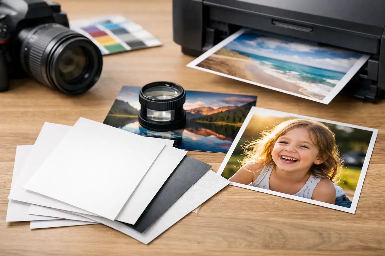
A bright family photo can look flat on the wrong finish, while a black-and-white portrait can lose its character if the paper is too shiny. If you are asking what paper is best for photo prints, the useful answer is not one paper type for every image. It depends on where the print will be displayed, how it will be handled and the look you want to achieve.
For most everyday prints, a professional photo paper with a glossy or lustre finish gives the best balance of colour, detail and value. But matte paper, fine art paper and specialist finishes all have a place. Here is how to choose without making it more complicated than it needs to be.
What paper is best for photo prints?
For colourful holiday photos, children’s pictures, phone snaps and prints for albums, glossy photo paper is often the best choice. It gives colours a strong, bright appearance and makes images look sharp. It is a familiar finish for classic photo prints and works particularly well when you want pictures to stand out.
If you want a more practical all-round option for frames, gifts or prints that will be passed around, choose lustre photo paper. Sometimes called satin or semi-gloss, it has a soft sheen rather than a mirror-like shine. It keeps much of the colour and detail of glossy paper while reducing reflections and visible fingerprints.
Matte photo paper is best where a non-reflective, understated finish suits the photograph. It is a strong option for black-and-white images, soft portraits and prints displayed under bright room lighting. Colours can appear less vivid than on gloss, but that can be exactly the right result for a quieter, more natural look.
The best paper is therefore the one that matches the photo and its intended use. A print for a busy family album has different needs from a large wedding portrait for a hallway wall.
Glossy photo paper: best for bold colour and detail
Glossy paper has a smooth, reflective surface. It gives photographs a clean, high-impact finish, with rich blacks, strong contrast and vibrant colour. Blue skies, green landscapes, party decorations and sunny holiday shots all tend to benefit from it.
It is a particularly good choice for smaller standard-size prints. In an album or photo box, glossy prints look crisp and familiar, and the finish makes the most of good exposure and sharp focus. It also works well for images from modern smartphones, which are often processed to have punchy colour and contrast.
The trade-off is reflection. A glossy print hung opposite a window or lamp may be harder to view from certain angles. Its smooth surface can also show fingerprints more easily, especially on dark areas. If you are printing photos for children to handle, or you are framing an image in a bright room, lustre may be the more forgiving option.
Lustre paper: the practical choice for most prints
Lustre paper sits between gloss and matte. It has a subtle texture and gentle shine that gives photographs depth without the strong glare of a glossy surface. For many customers, it is the safest choice when they are not sure which finish to order.
It works well for family portraits, wedding photos, school pictures, pet photographs and enlarged prints for frames. Skin tones remain natural, colours look pleasing and the finish is less likely to show marks from handling. This makes it especially useful for prints that will be given as gifts or viewed regularly at home.
Lustre is also a sensible option for mixed photo orders. If you are printing a selection of holidays, birthdays, everyday phone pictures and a few favourite portraits, one lustre finish can give the whole set a consistent, professional appearance.
Matte paper: best for low glare and a softer look
Matte paper has little to no shine. Rather than reflecting light, it absorbs it, giving a calm and understated finish. This can make it easier to view in conservatories, bright kitchens or rooms with lots of overhead lighting.
Matte is often chosen for artistic photography, black-and-white prints, old family photographs and portraits where a softer result is preferred. It can also suit restored photos, particularly when the original image has a gentle, vintage character. The lack of glare is useful when prints are being scanned, copied or displayed behind glass.
However, matte is not always the best choice for every colourful image. A vivid sunset or highly detailed landscape may look more lively on gloss or lustre. Matte does not make a poor photo better, either. If the image is dark, low resolution or slightly blurred, its softer finish can make those limitations more noticeable.
Fine art and heavyweight paper: when the print is the finished piece
Fine art papers are designed for photographs intended as display pieces rather than everyday prints. They are usually thicker and may have a textured or cotton-based surface. The finish can add depth and character, particularly to carefully edited portraits, landscape photography and black-and-white work.
This type of paper is worth considering when you have a special image to frame, sell, exhibit or give as a meaningful gift. It can create a more tactile, gallery-style result than standard photo paper.
There is a trade-off in cost and style. Fine art paper is not automatically better simply because it is premium. A bright phone photo from a birthday party may look more natural and appealing on standard lustre paper. Save specialist finishes for pictures where the texture and subtle colour reproduction genuinely add something.
Paper finish matters, but image quality matters first
Even the best photo paper cannot add detail that is not in the original file. Before ordering, check that your image is sharp, well lit and large enough for the print size you want. A photo that looks fine on a small phone screen can appear soft when enlarged.
For standard prints, most recent smartphone photos and digital camera images will produce good results. For larger enlargements, use the original image rather than a screenshot, image sent through a messaging app or picture saved from social media. These versions are often compressed and may not have enough detail for a clean large print.
It is also worth checking your crop. Phone cameras commonly use a different shape from traditional photo prints, so a little of the image may be trimmed at the edges. Keep faces, hands and important details away from the very edge where possible. If your ordering screen offers a preview, use it before checkout.
Choose paper by where the photo will live
A practical way to decide is to start with the final destination. Album prints benefit from glossy or lustre paper because they provide clear detail and good colour. Framed pictures in well-lit rooms are usually better on lustre or matte paper, as both reduce distracting reflections. For a special wall display, consider a larger lustre print, fine art paper or an alternative such as canvas or aluminium, depending on the style of the room.
For gifts, think about handling. A lustre finish is a reliable choice for framed family photos and keepsake prints because it is less prone to showing fingerprints. Glossy is ideal when the aim is bright, cheerful colour, while matte can suit a more restrained portrait or heritage image.
If you are creating a collection of prints for an album, consistency is helpful. Using the same finish across a set gives it a tidy, considered look, even if the photographs were taken years apart on different devices.
A simple choice when you are ordering online
If you still cannot decide, choose lustre for a versatile finish that suits most photos and most homes. Choose glossy when you want maximum colour and shine. Choose matte when glare is a concern or when you prefer a softer, less reflective result. Choose fine art paper for a photograph that deserves to be treated as a display piece in its own right.
At Photo Zone, lab-quality printing makes the difference between an image that stays on a screen and one you are pleased to put in a frame, album or gift. Start with the photo you love, choose the finish that suits how you will enjoy it, and let the print do the remembering.